
This image was taken during the filming of the woods scene, which is why it looks like one of the scenes in the actual video. It was taken on a digital camera, with a contrast effect called ‘vivid’. This is why the image looks slightly cold. In Photoshop, we desaturated the image and used the history brush tool to re-colour the puppet and Harry.

The image above, was taken in the woods, it was the alleyway used in the video. The image was already taken on a bright day, which is why the top of the image is so bright already. We did not do too much to produce the image on the right. This is because it was such a good photograph, not much was needed. We desaturated the image and used the lasso tool to draw around the alleyway opening at the top of the stairs. This meant the whole image was desaturated, except the semicircular shape at the top of the stairs, which is the original colour. I also brightened this semi circle slightly, so that is was noticeable. When I realised that this image was going to be used for behind the CD, I realised that none of this was necessary, as it would not show.

This image above, was taken on and iPhone (not the digital camera), which explains the portrait position of the image. The original photograph was taken, with a torch underneath the camera, facing up towards Harry’s face. This is why he is so brightly lit. We then desaturated the image and increased the saturation of the image. We also erased the background with a faded brush, so that the edges were not too harsh. I then used the circular shape tool to draw a circle around the image, and inverted the image so that I could erase the outer shape. This was the image use for the CD.

This image above, was supposed to be used for the back cover of our digipack; however, the back cover of the digipack had to be scrapped as it looked unprofessional. Editing the puppet turned out to be a lot harder than originally expected due to the puppets hair, and the original lighting. To produce the image on the left, we had to increase both the contrast and brightness of the image. We also added a faint lighting effect (spotlight) in the bottom left corner of the image. We also erased the background of the image with a faded rubber, to ensure the edges were not too hard. We then placed the image on a black background.

This image above, was very hard to take. During filming we had the idea to take an image of Harry and the puppet. Megan was in charge of holding the puppet in position; Hulya had to make sure the lighting was correct, while I took the picture with the flash off. Originally, we thought it was a very good image, however, when we tried to use it, it was way too dark. We could not take a brighter image because then the shadow would not show. We attempted to brighten the image and edit the levels and curves of the image. We reduced the fill of the image to 80% and placed it on a black background. However, this just ended up looking pixelated and amateur. The image was simply too hard to edit in the first place. So we did not end up using this image, event though we spent the longest amount of time trying to edit it.
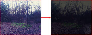 This image above, was eventually used for the back cover of our digipack. The image was taken in the woods, where some of the footage was filmed. To create the image to the right, we had to reduce the fill and opacity of the original and place it on top a black background. Also to the bottom right corner of the digipack, is an extremely faint image of Harry. The opacity and fill are both at 20%, so it is extremely faint. I decided to incorporate this because it is unnoticeable, similarly to how the puppet was unnoticeable to Harry.

 Our main concern with the digipack front cover was the positioning of the text. We had already decided on the image, because it was the same image used for the magazine advertisement. We wanted to use the same image to encourage house style, and because the magazine advert was promoting the album, so it made sense to use the same image. The killers actual album, was called Sawdust, so this is what we named our album. The two images above were our original ideas of front covers, but not everyone in the group was happy with them. So we decided to research actual albums by The Killers, and we found that in most of their album front covers, all the text was placed in the centre somewhere. The two front covers to the bottom sides of the image, show examples of actual album front covers by The Killers. The image in the centre, at the bottom, is our final front cover.
 The back cover of the digipack also caused disputes between our group as not everyone was happy with it. The image at the top was our original back cover. However, it lacked in professionalism and looked rather amateur in comparison to the other digipack parts. The problems are highlighted in the image. So we decided to erase the image of the clown, place an image as the background, and centre the text. We also placed the image of Harry in the right hand bottom corner of the digipack. Once everyone was happy with the design of the back cover of the digipack, we had a few dilemmas in terms of text; we could not decide between ‘BIRTH OF A HERO’ and ‘SWEET CONFUSION’. The first font has been used before for the word ‘the’ in the magazine front cover, and for the front cover of the digipack. This is good because it shows a use of house style between the documents. The second font has not been used elsewhere, in the digipack or in the magazine advertisement; however the eeriness of the text compliments the 'Shadowplay' theme of our video. Also it can be argued that house style has been shown elsewhere in the digipack; such as the same use of fonts for the front cover and the magazine advert. To overcome this, we will ask people in our class to choose which they feel to be more appropriate.


