
Below are all the different texts we could use for the name of the band 'The Killers'. I asked 10 people from our target audience and then Megan(M), Hulya(H) and I(A) chose our favourites. Everyone chose 2 fonts and we had to decide on the best.
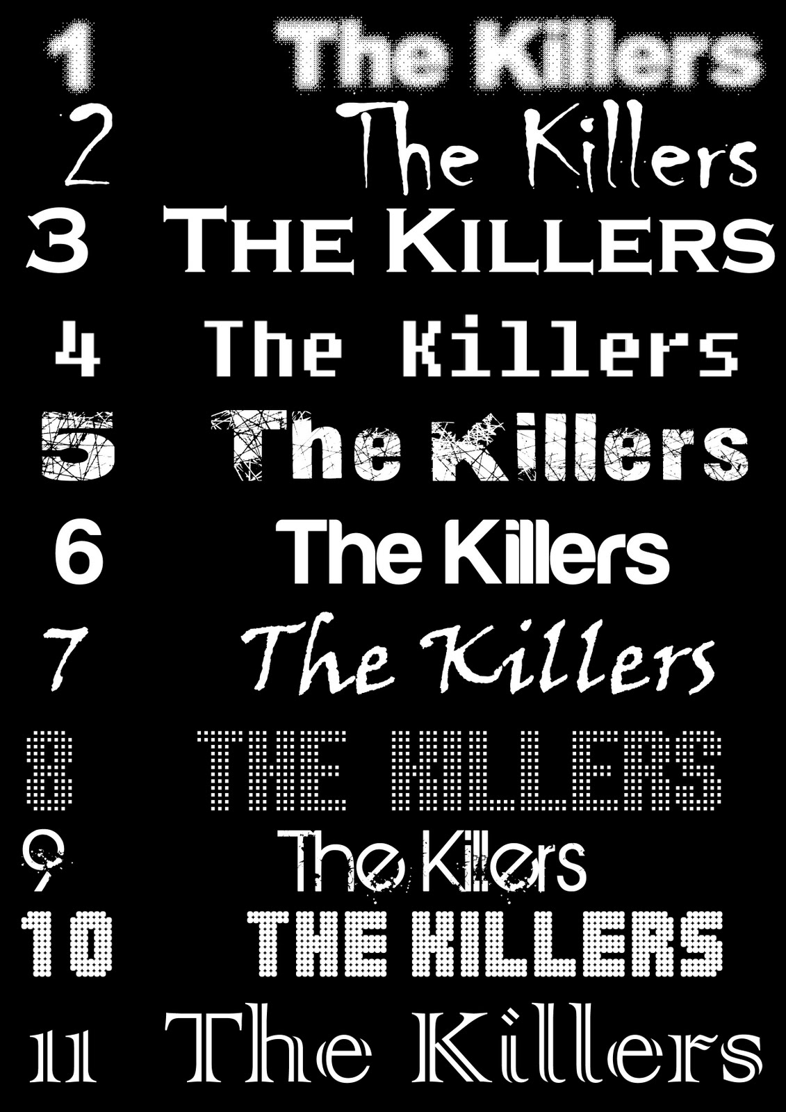 From Our Research The most popular fonts were font 10 and font 9. So we checked what the actual 'Killers' font was and, to our surprise; it consisted of both fonts 9 and 10. This was a relief because we could adapt from the original Killers font. Font 10 is called 'Balls on the rampage'. Font 9 is called 'BIRTH OF A HERO'. So these are the two fonts we will use for 'The Killers'.
Below, are all the different texts we could use for the name of the single 'Shadowplay'. I asked 10 people from our target audience and then Megan(M), Hulya(H) and I(A) chose our favourites. Everyone chose 2 fonts and we had to decide on the best.
 From Our Research The most popular font was font 9. We tested this font with 'The Killers' font and they did contrast. However the contrast did work with our theme. The font did look slightly eerie, and the contrast of fonts worked well with the 'split personality' application. Font 9 is called 'Rage Italic'. So this is the font we will use for 'Shadowplay' text.
Below are all the different texts we could use for the average text on the magazine advert as well as on the digipack. To introduce use of house style, we want to use the same fonts on the magazine advert as on the digipack. I asked 10 people from our target audience and then Megan(M), Hulya(H) and I(A) chose our favourites. Everyone chose 2 fonts and we had to decide on the best. The stars at the bottom are for the magazine advert. From research, we found that magazine adverts usually have star ratings, so I had to find a font which suitably looked like stars.
 From Our Research The most popular font was font 5. This font is called 'Calibri'. So we will use this font the most. However, fonts 4, 6, 7 and 9 were also quite popular. This is useful because on the magazine advert, not all the text font will be the same, that would be boring and too plain. So we will experiment with the fonts 4,6,7 and 9 as well. The main font will be font 5 though. Having said this, we want to include the HMV banner to the magazine advert, so we will have to use font 8, because that is the font used for the HMV banner. Font 8 is called 'Comic Sans MS'. Also some fonts may work better than others, so it is hard to choose specific fonts for the text. Font 4 is called 'Bell MT'. Font 6 is called 'Candara'. Font 7 is called 'Century Gothic'. Font 9 is called 'Corbel'.
No comments:
Post a Comment